You can globally replace the typewriter font (i.e. the font LaTeX uses when you e.g. say \texttt{foo}) for the entire document by using the courier package.
In the preamble:
\usepackage{courier}
In the manuscript:
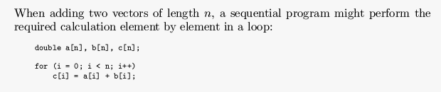
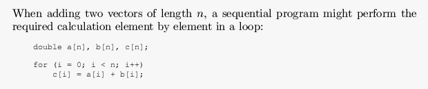
When adding two vectors of length $n$, a sequential program might
perform the required calculation element by element in a loop:

\begin{mylisting}
\begin{verbatim}
  double a[n], b[n], c[n];

  for (i = 0; i < n; i++)
      c[i] = a[i] + b[i];
\end{verbatim}
\end{mylisting}
(The mylisting environment is discussed on the How can I get source code listings nicely printed? page.)
As you can see from the screenshots above, the courier font is quite a bit thinner than the standard Computer Modern monospace font. This is precisely one of the reasons why I wanted to use Courier in the first place: I needed a monospace font that had a visibly different bold variant — the built-in version does not.
However, the thinness of regular Courier can also cause visibility problems, especially at lower font sizes. Also, when the thesis is printed, the high-resolution printing process will make the font display even thinner than it does on output from your own laser printer. In general, I think a 10pt Courier font size is still perfectly readable, but keep the above in mind if you want to go lower.